Building Credibility
From Zero, By Design
How Beyond Media Marketing built a complete brand identity for a new legal outsourcing agency, so it looked established on day one.
Meet the Client
More than overflow help—
an operations partner.

Industry
Legal Outsourcing
Case Support · Admin Operations · Law Firms
Case Pro Management supports law firms with the administrative operations that keep cases moving intake, file handling, and day-to-day case support. Their model is built on structure: the firm practices law, Case Pro runs the process behind it. They needed an identity to reflect their experience, industry knowledge, and ability to help firms optimize their operations.
But the company existed only as a concept. There was a business model, a clear vision, and interested firms already lining up, and nothing to show them. No logo, no identity, no collateral, no public-facing presence of any kind. We had to work quick to establish a strong foundation from the get-go.
The Journey
A company that existed only on paper
When Case Pro Management reached out to Beyond Media Marketing, they were starting from nothing, and they needed a solution yesterday. Potential clients had already begun to line up, and every conversation without a professional brand behind it was a risk to the first impression.
They weren’t rebranding. There was no old identity to evolve, no equity to preserve and no existing look to improve on. They were being branded for the first time, in an industry where credibility is the entire pitch.
The Challenge
Looking established on day one
No existing assets
Every touchpoint, from the business card handed across a table to the signature at the bottom of an email, had to be designed from scratch, and quickly.
A trust-driven industry
A new brand that looks new, unproven or informal doesn’t get a second meeting, however good the service behind it is.
Partner-ready, not startup-ready.
Early-stage energy and creative flair would have worked against the message. The question was how to launch a new company into the legal industry without looking new, unproven or informal.
The Approach
Structured. Symbolic. Built to scale.
Structure Over Style
Because Case Pro serves law firms, the brand needed to feel organized, controlled, process-driven and operationally mature. The identity had to read as a systems company, not a creative agency. That meant restraint: clean forms, disciplined hierarchy and nothing decorative that didn’t earn its place. In this industry, the design persuades by looking dependable.
Symbolism Rooted in Workflow
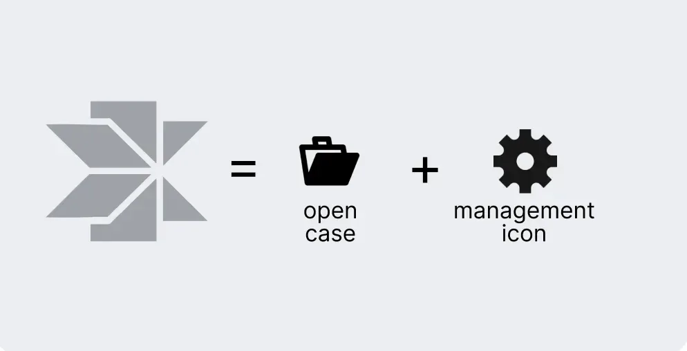
From the first concept round, the logo system was anchored in the ideas that define Case Pro’s work: case progression, file movement, operational flow and efficiency through structure. The final direction used stacked and rotational forms that resemble an open case file combined with a management structure. The mark communicates movement, continuity and flow before anyone reads the name.
A Complete Identity System
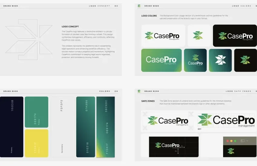
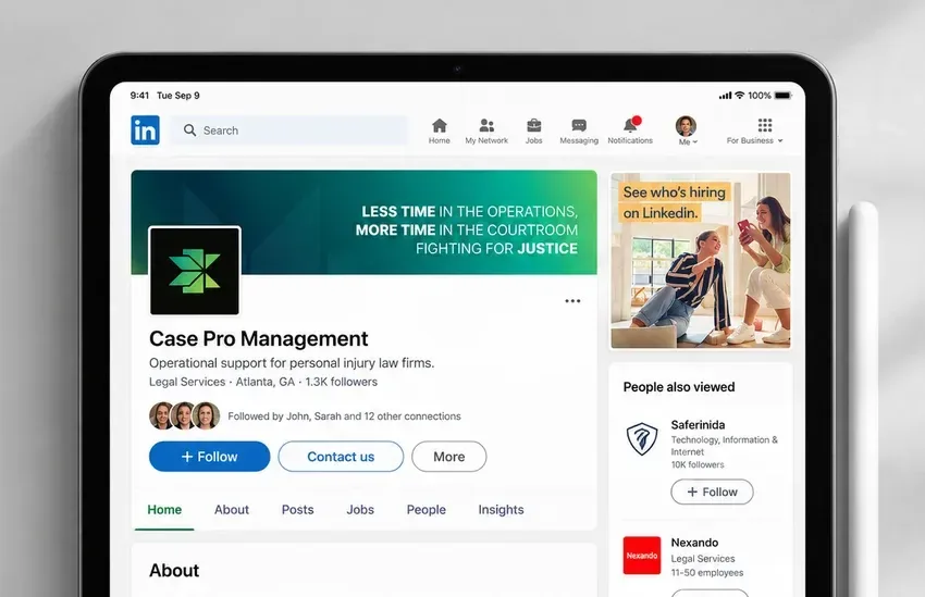
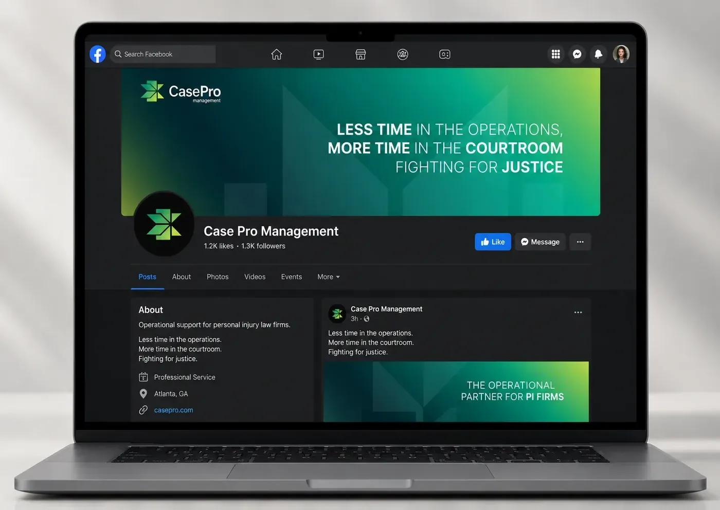
Around the logo we built the full visual language. The primary and secondary color palette is supported by gradient systems that add depth and flexibility, and high-contrast rules keep everything legible in legal document applications. The typography is clean and professional, with clear hierarchy rules for headings, subheaders and body copy, and it is optimized for both print and digital.
A Brand Built for Scale
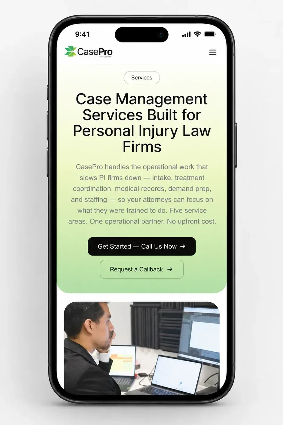
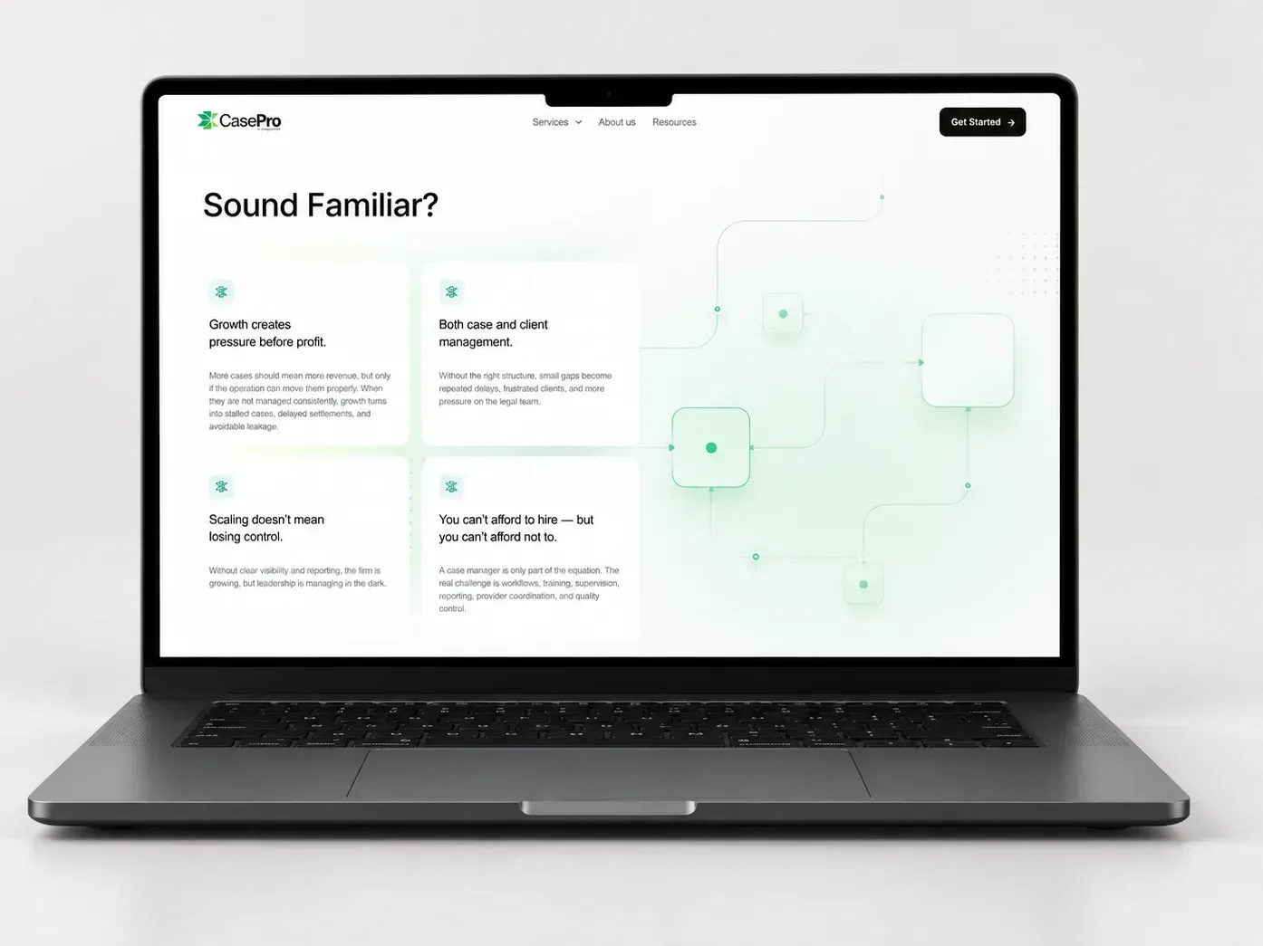
The system was designed to stay legible across legal documents, dashboards and internal workflows, and to translate cleanly to social, email, print and merchandise. It also had to scale from a startup to a full operational firm. The brand needed to work years into growth as well as at launch.
The Solution
A Brand System, Not a Logo.
A flexible logo system
The master logo comes with horizontal, stacked, icon-only and monochrome variations, so it fits anywhere from a letterhead to a social avatar. Safe-zone usage rules and misuse guidelines are built into the brand book to protect it as more people start using it.
A complete color and type system
Primary and secondary palettes, gradients and accessibility-grade contrast are paired with a typographic hierarchy that works for headings, subheaders and body copy in both print and digital environments.
Sales-ready collateral
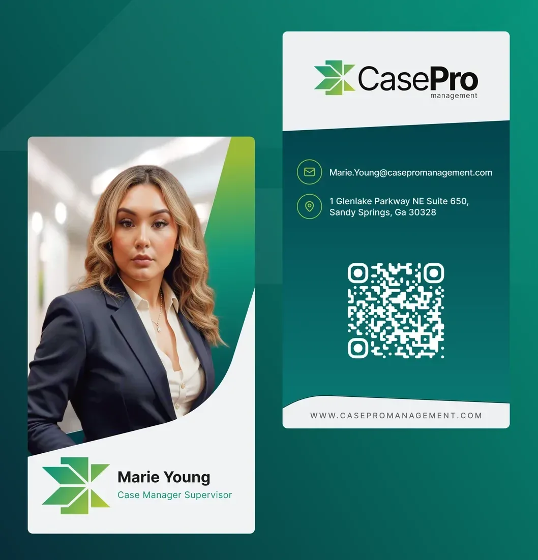
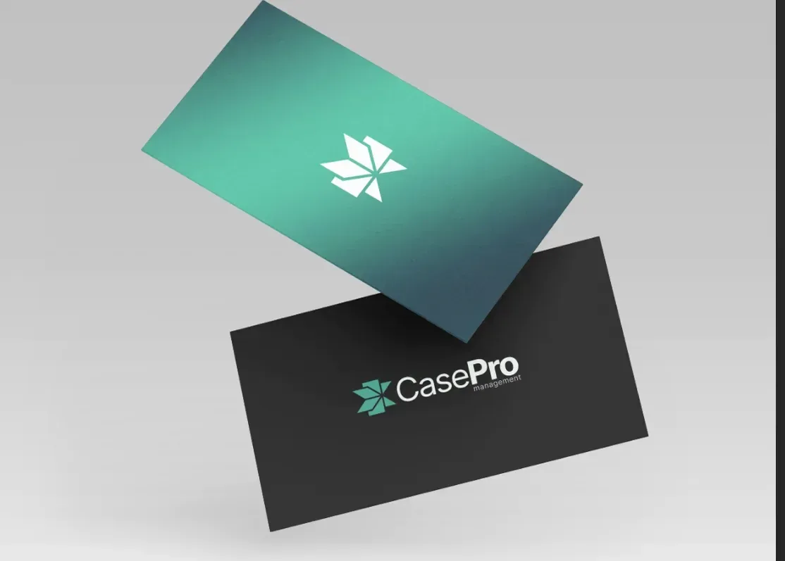
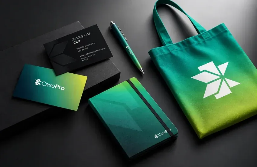
The double-sided premium business cards are logo-forward and laid out for client meetings. They were designed for the first handshake in a law firm conference room.
A branded physical presence
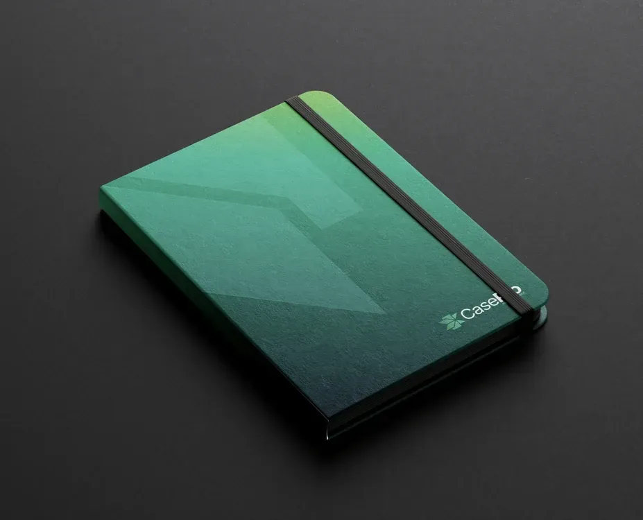
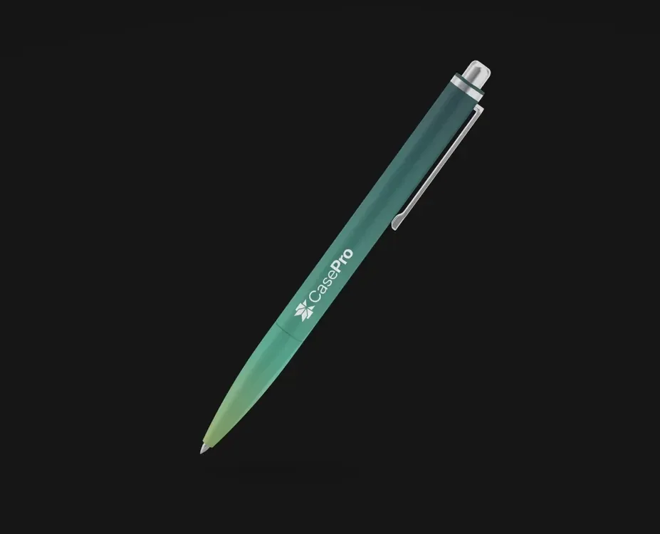
A branded notebook, pen and tote bag were designed for internal team use, client onboarding and conferences, so the brand carries beyond the screen and stays in front of the people Case Pro works with.
Results that speak—
and start conversations.
Launched fully branded
Case Pro went to market with a complete professional identity on day one. There was no awkward early phase of improvised assets.
Instant credibility
The brand is perceived immediately as structured, organized and trustworthy, which is exactly how attorneys and firms need to see a partner who will handle their administrative operations.
Clear differentiation
Case Pro stands apart visually from generic outsourcing brands, with a look built on operational thinking instead of stock professionalism.
Sales-ready from delivery
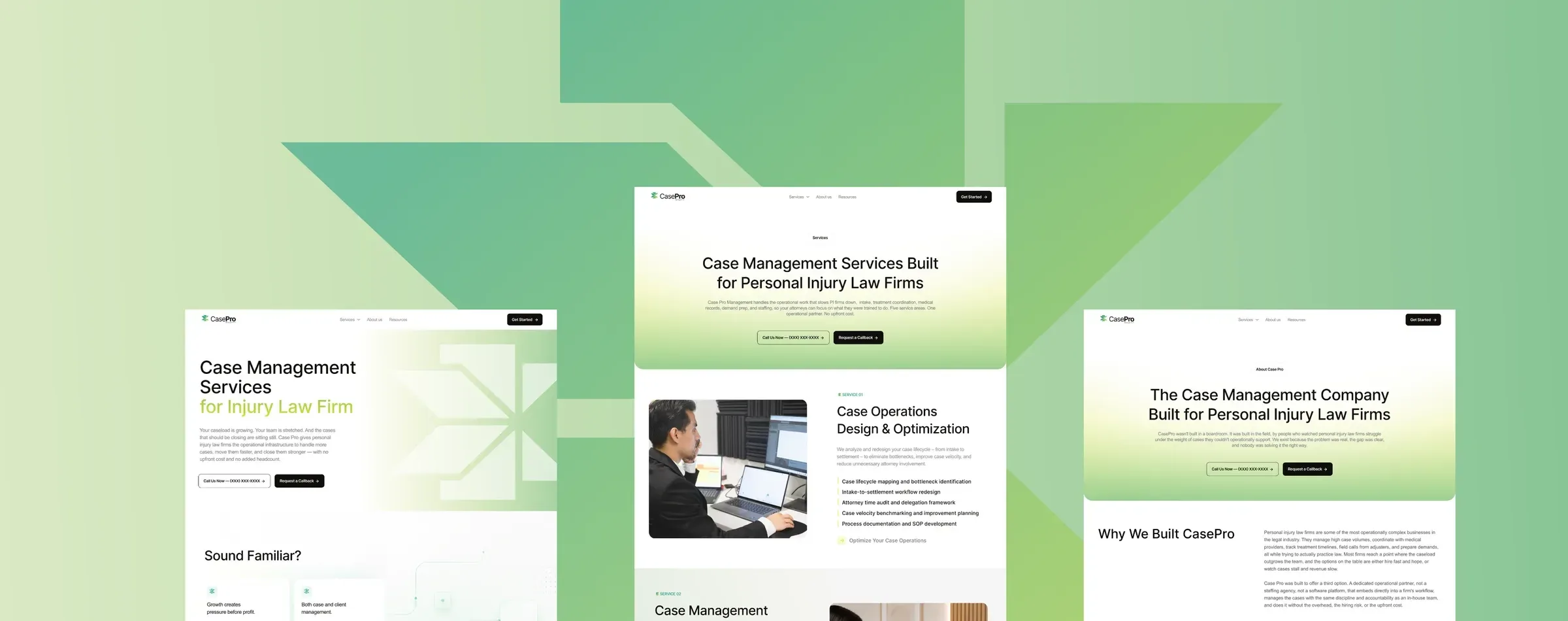
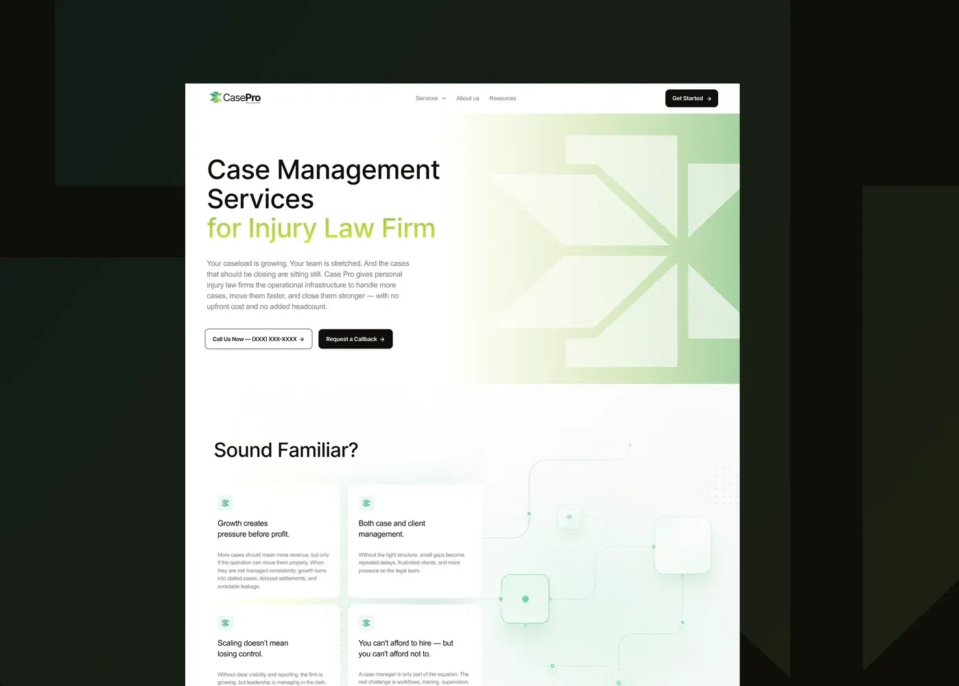
Collateral, digital assets and brand rules were delivered production-ready for print and digital, so the team could start law firm outreach, marketing and recruitment straight away.
Project Gallery